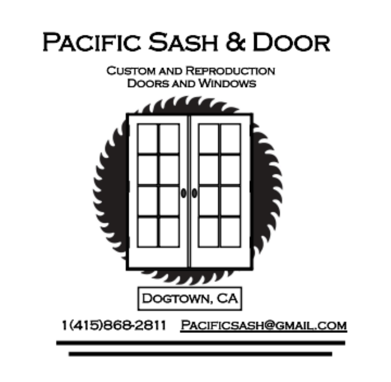
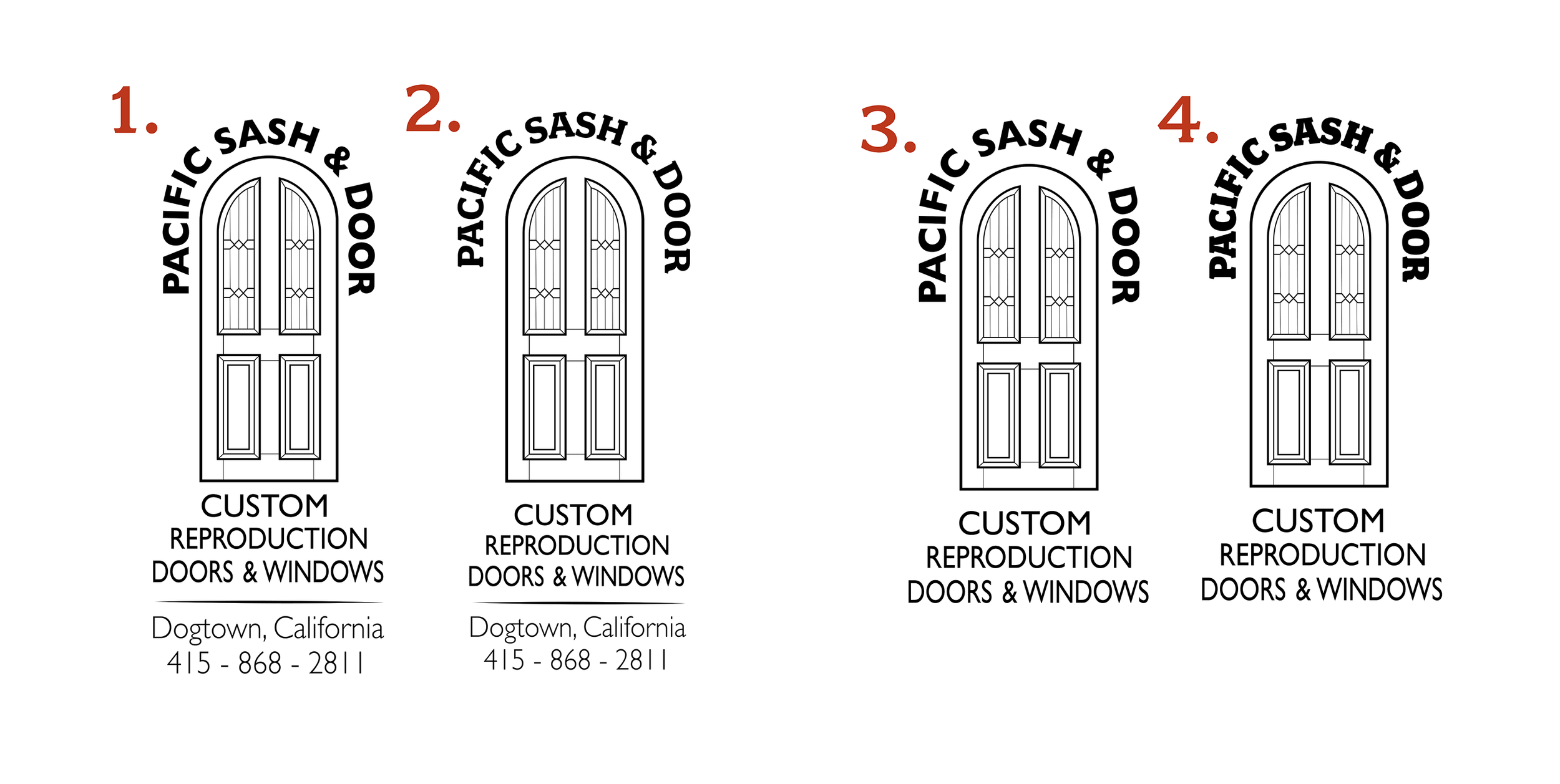
Pacific Sash & Door - Logo ReDesign
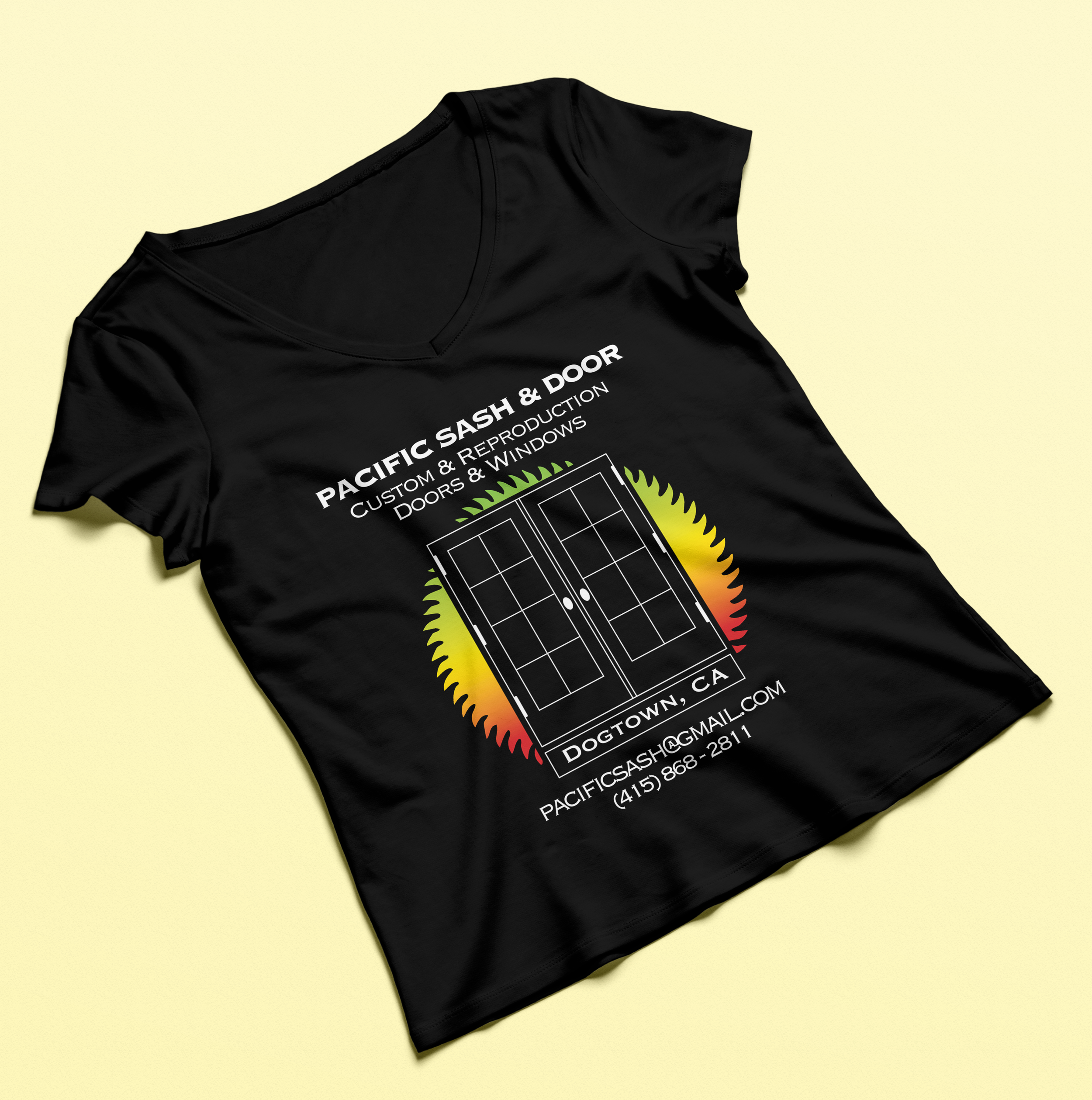
Pacific Sash & Door is a family-run company specializing in custom and reproduction doors and windows. Their original logo concept was created by the client and featured a pair of doors inside a saw blade; an idea that reflected both craftsmanship and heritage. My role was to refine that concept into a professional, print-ready logo system that could adapt to apparel, business cards, signage, and merchandise.
Goals & Challenges
The goal was to keep the recognizable window-frame idea but give Pacific Sash a logo that felt cleaner, more confident, and easier to use in real-world applications. The challenge was working within the constraints of the original concept while fixing issues with weight, spacing, and proportion. The old mark had heavy outlines, uneven geometry, and type that didn’t hold up at small sizes, so the redesign had to solve those problems without losing the brand’s identity. The result needed to be modern, balanced, and versatile enough for everything from signage to web use.
Concept Development
Concept development started with stripping the logo down to its essential idea: a clean, straightforward window frame paired with strong typography. From there, I explored ways to refine the geometry so the mark felt intentional instead of bulky. I tested different stroke weights, corner treatments, and proportions until the icon felt stable and readable at any size. On the type side, I tightened spacing, adjusted letterforms, and worked toward a style that matched the simplicity of the mark. The goal was to evolve the original concept instead of reinventing it, keeping what worked while improving everything that didn’t.
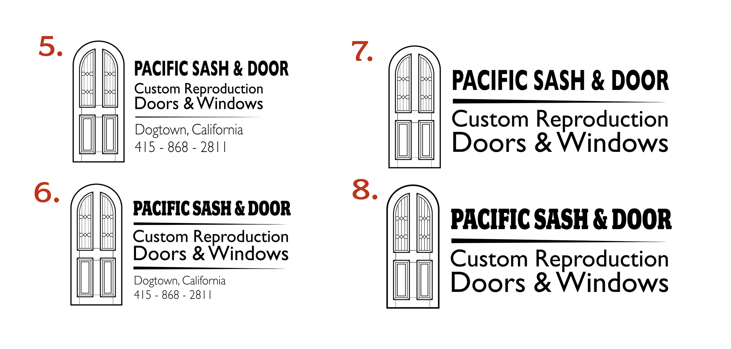
Design Execution
During the design execution phase, I translated the refined concept into a polished, functional logo system. I focused on creating a balanced relationship between the window-frame icon and the wordmark, ensuring both elements were clear and legible at any size. I experimented with stroke weights, corner treatments, and spacing to maintain visual harmony, while selecting a type style that complemented the icon’s simplicity. The final design was built to be versatile, working seamlessly across print, digital, and environmental applications without losing its integrity.
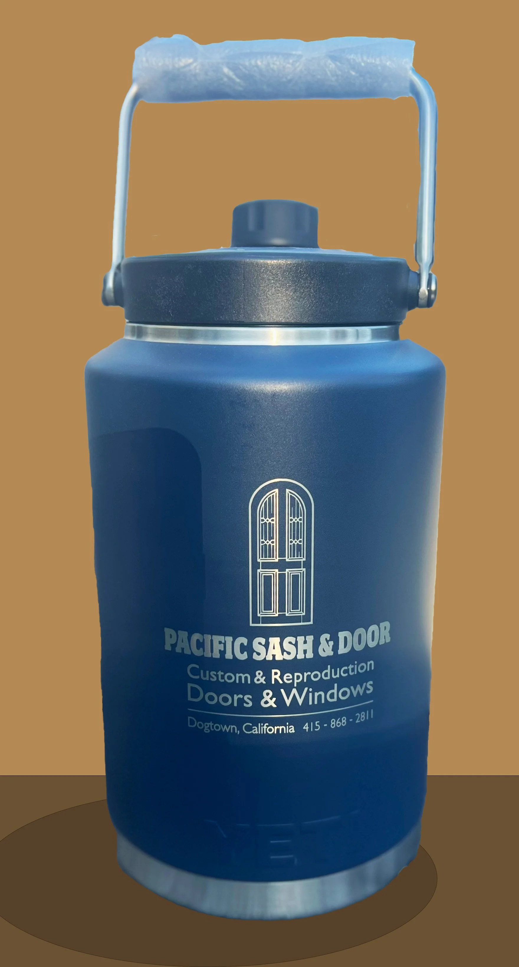
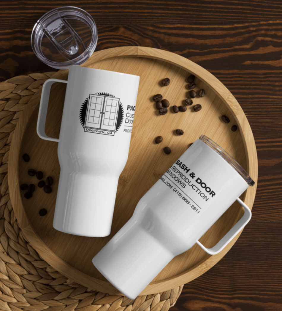
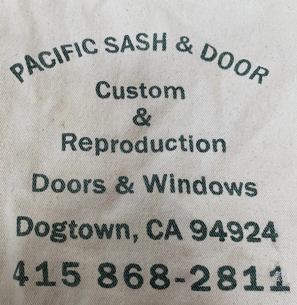
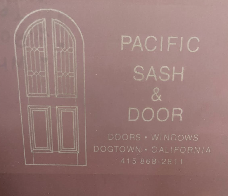
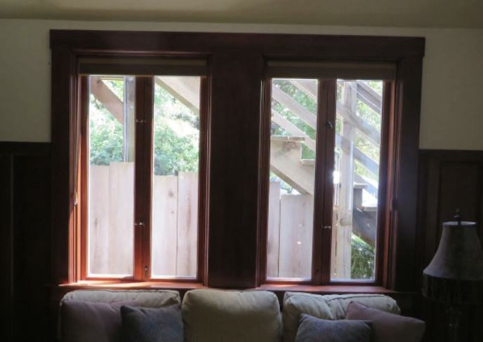
Mockup’s