99% Podcast - Poster Design
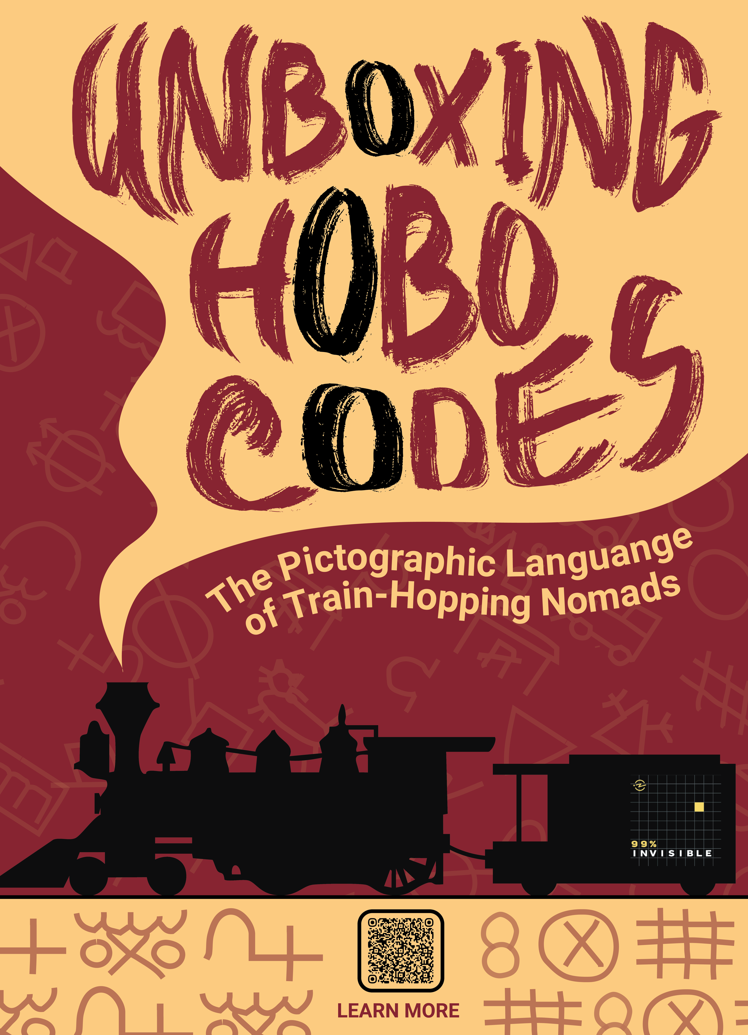
For this project, I revisited a poster and podcast cover I originally created in my Graphic Design 1 class. The assignment was to merge the visual language of a well-known designer with a specific episode of the 99% Invisible podcast. I chose Jon Contino for his hand-drawn, gritty, vintage- Americana style, and paired it with the episode “Unboxing Hobo Codes.”
This episode digs into the symbols used by train-hopping workers in the early 20th century, so Contino’s expressive lettering and raw textures fit the theme naturally.
Research & Inspiration
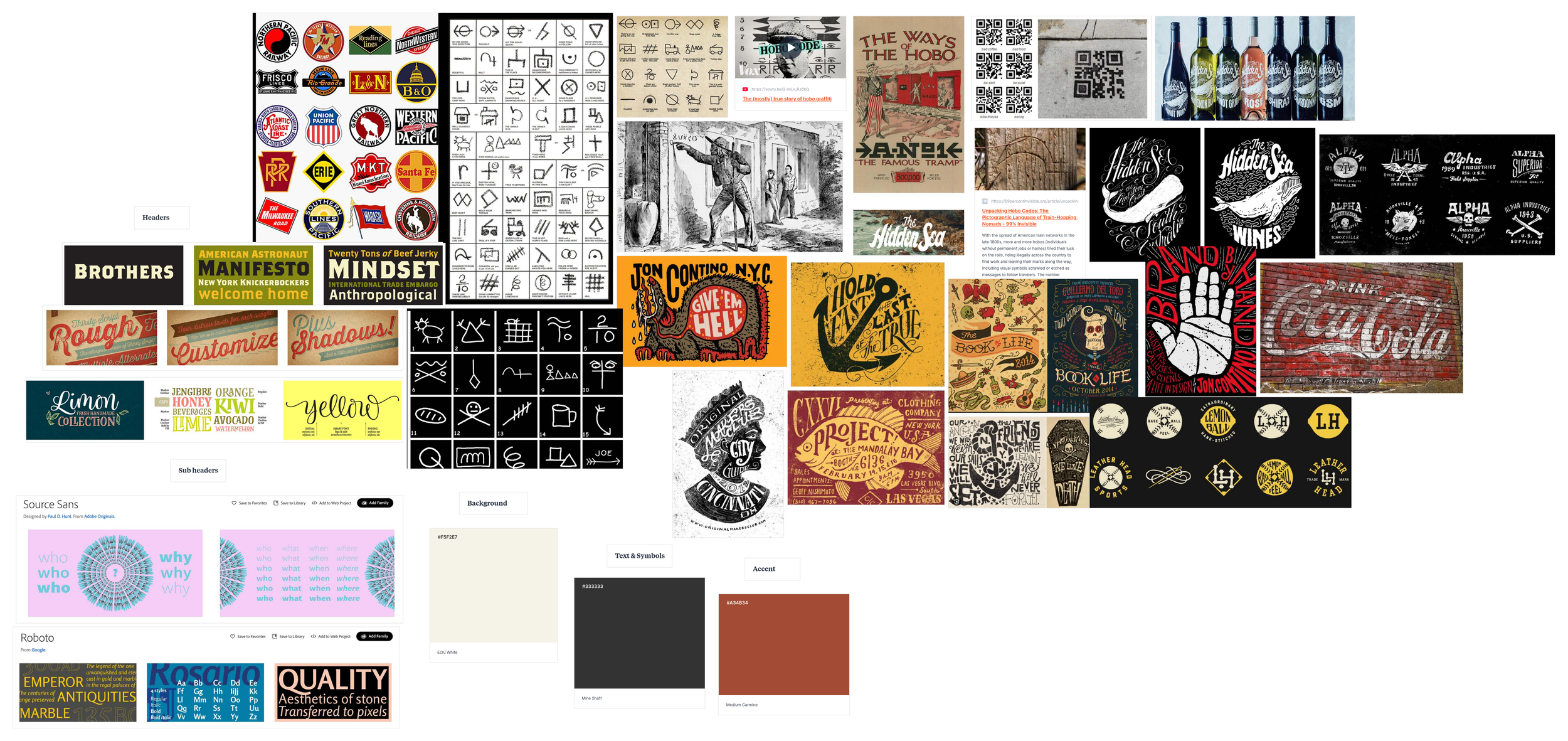
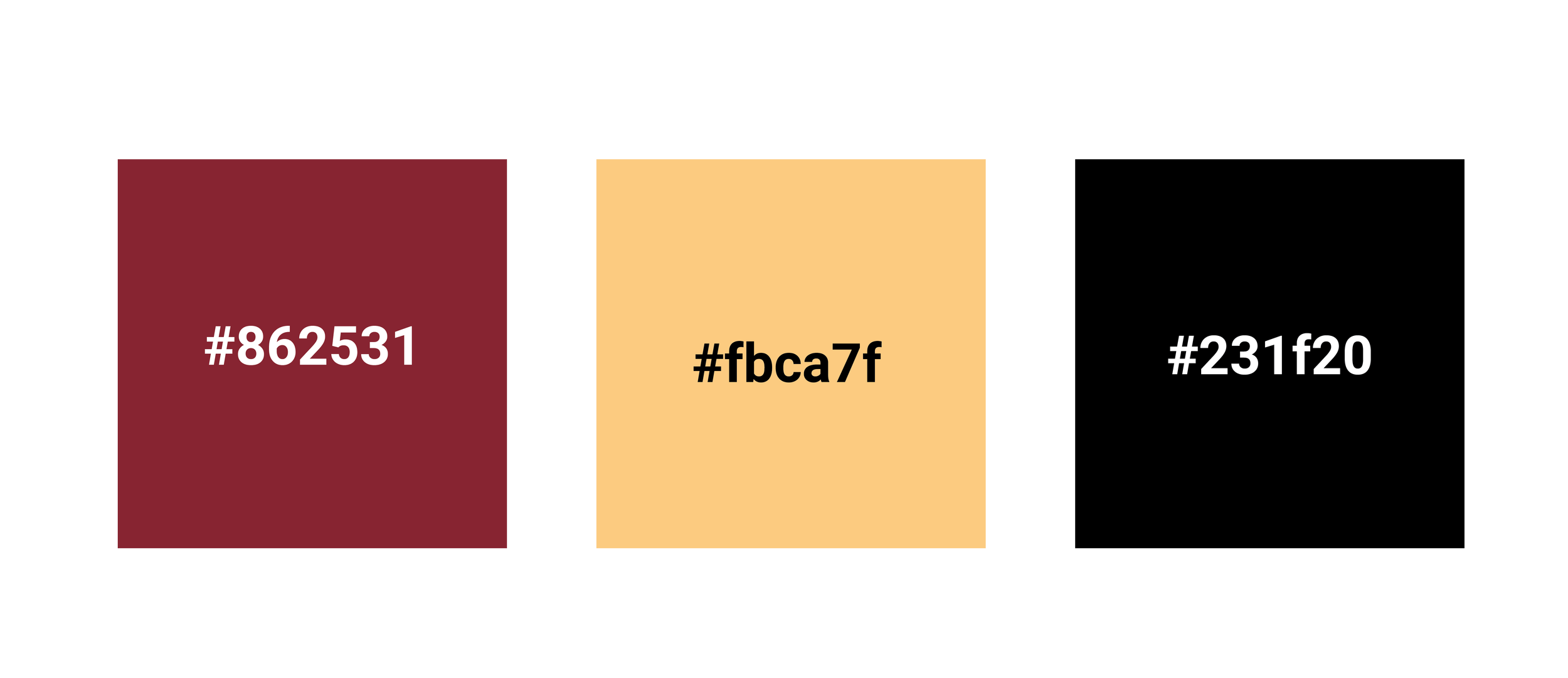
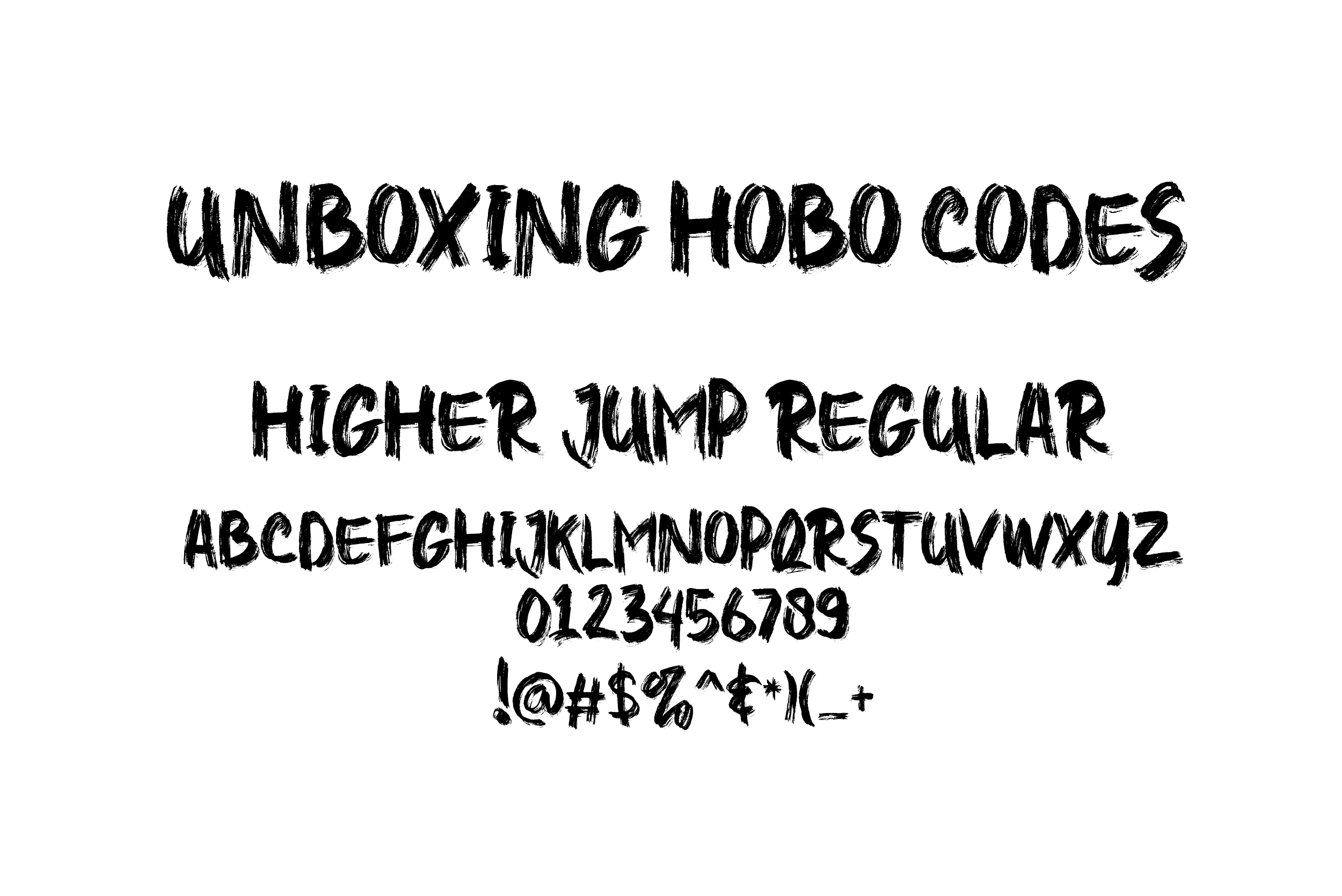
Before refining the poster, I went back and studied Jon Contino’s work more closely: Specifically his hand-lettering structure, the way he builds texture into every stroke, and how he mixes vintage grit with modern clarity. I also dug deeper into the “Unboxing Hobo Codes” episode, looking at actual hobo symbols, their meanings, and how they were used by travelers marking safe houses, dangers, or opportunities. That combination of research shaped the visual direction: the lettering needed to feel raw and imperfect, the textures needed to echo old signage and chalk marks, and the color palette needed to carry that dusty, weathered atmosphere from early American railways. All of that became the foundation for how I approached the revision.
Design Development
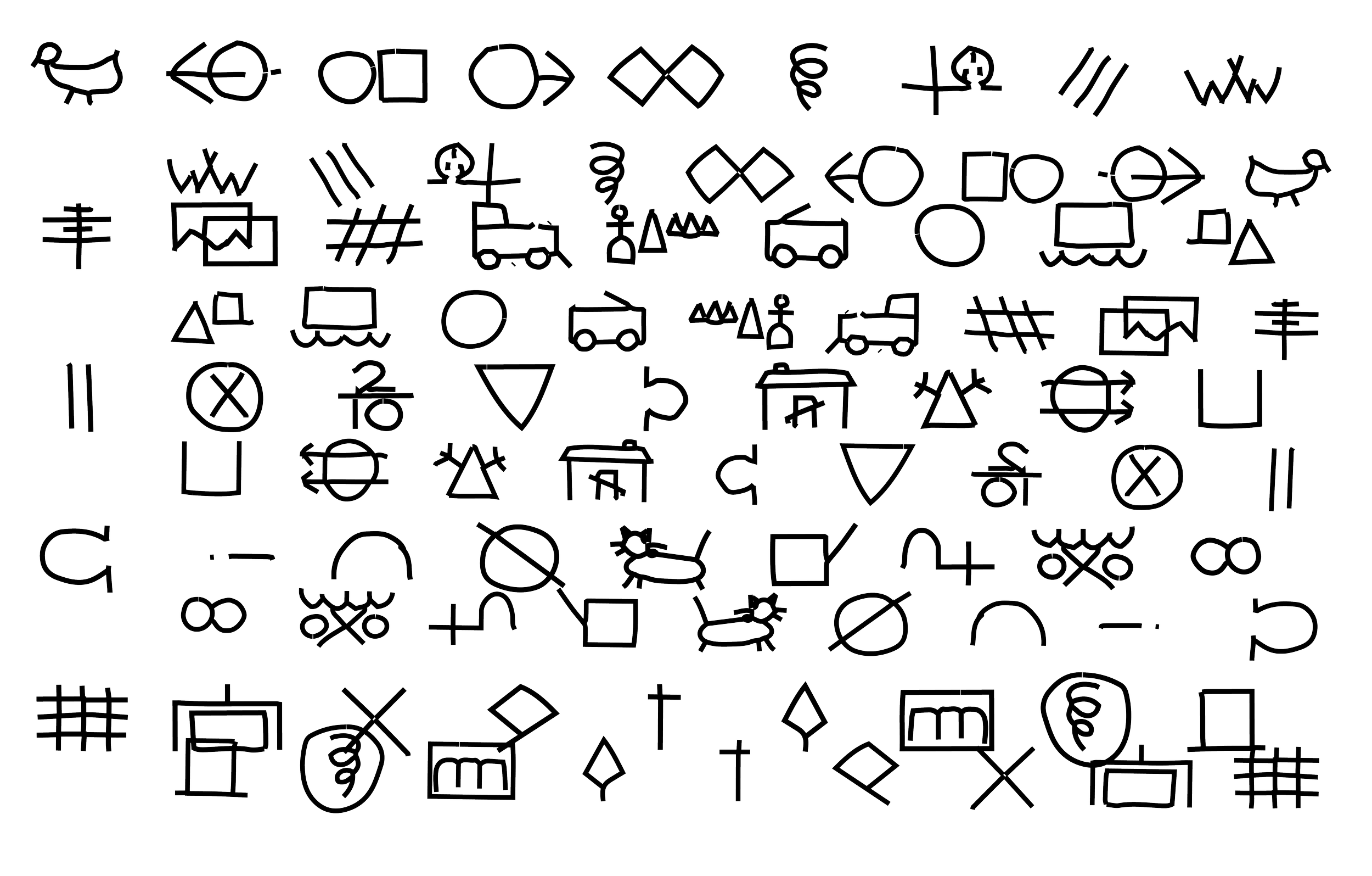
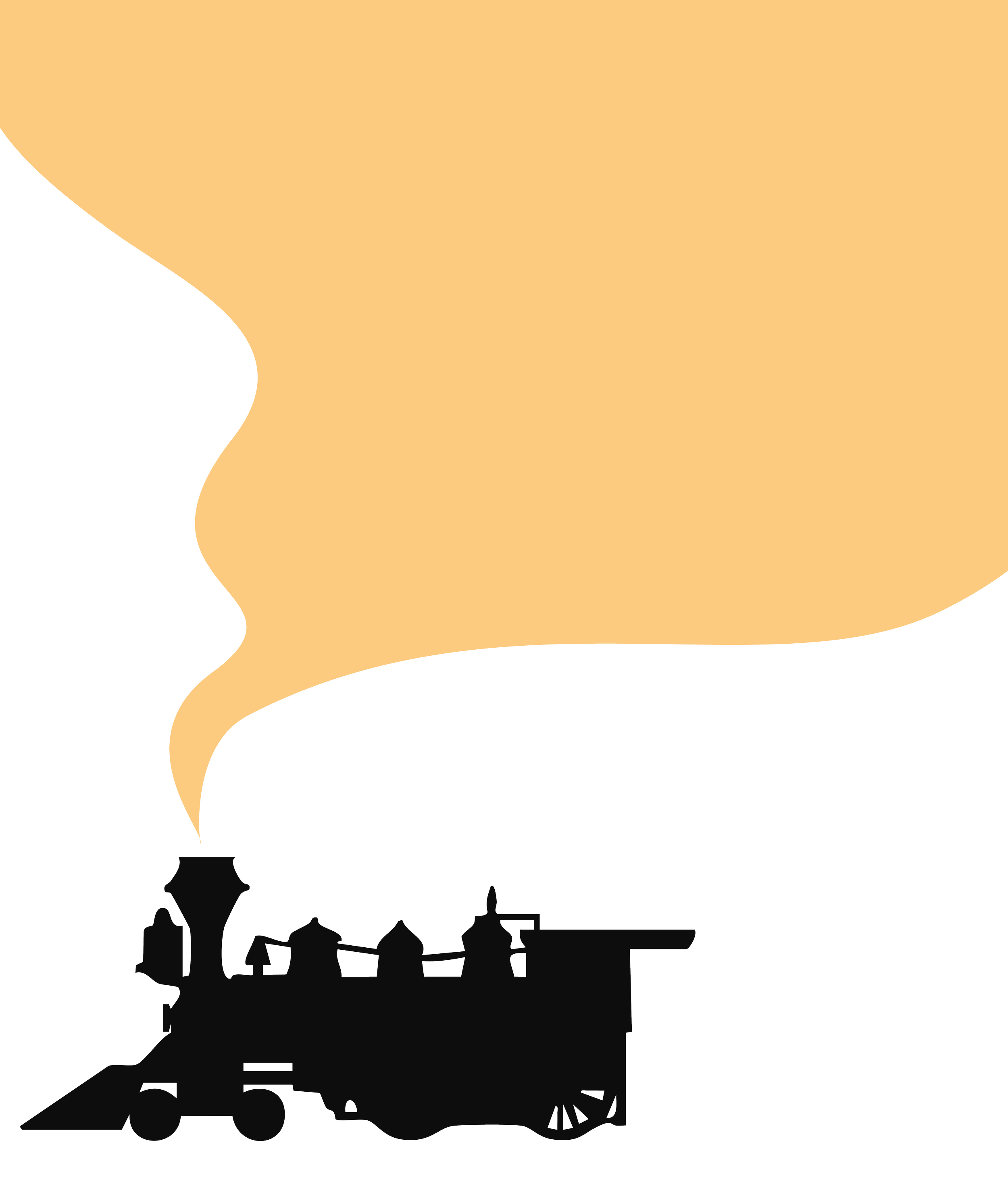
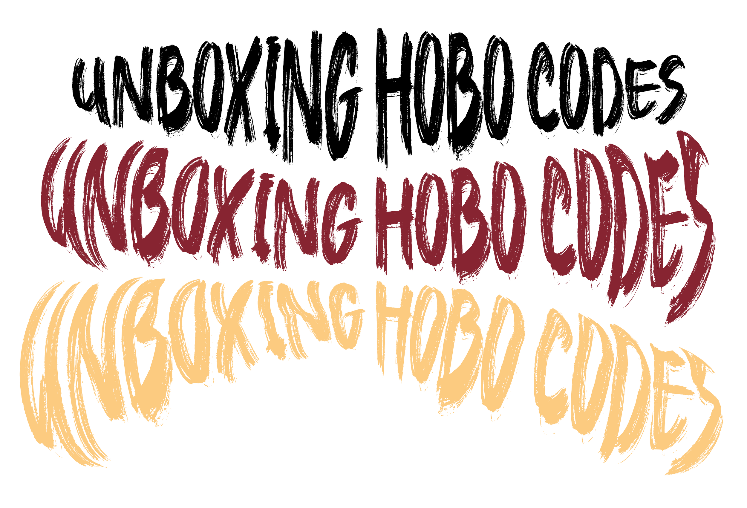
As I moved into development, I focused on tightening the core elements that carried the concept. I reworked the hand-drawn lettering first, testing different stroke weights, textures, and spacing until the title felt bold without losing the rough, human touch Contino is known for. From there, I refined the train silhouette, background symbols, and overall composition to create a stronger flow from top to bottom. I also experimented with color adjustments and texture overlays to make the vintage look feel intentional instead of muddy. Each pass clarified the hierarchy, strengthened the style, and brought the poster and podcast cover into a more unified visual system.

Final Design & Mockup
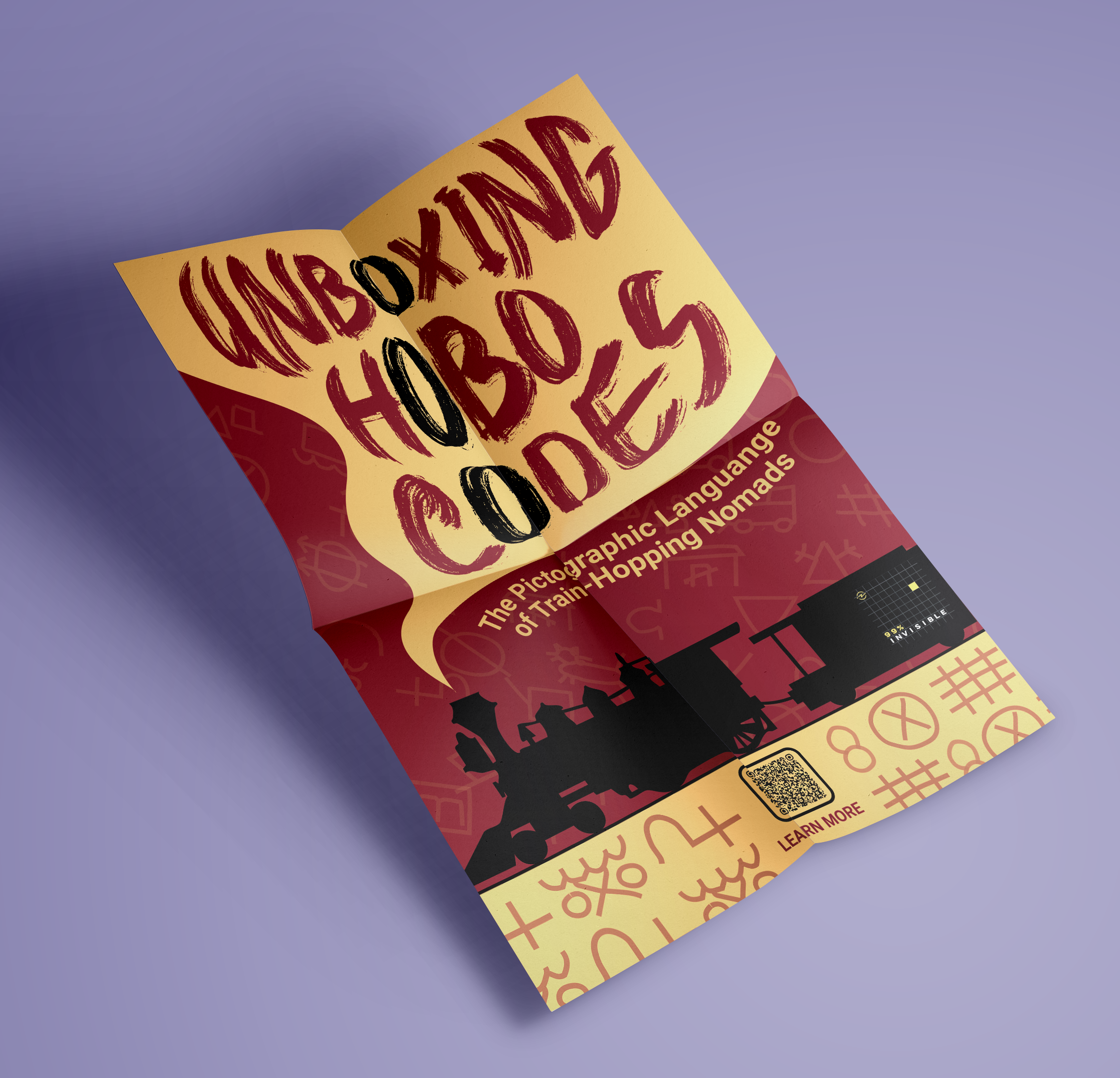
The final design lands much closer to the look I originally aimed for: Hand-drawn, textured, and clearly influenced by Contino without feeling like a copy. The lettering reads cleaner, the hierarchy is obvious at a glance, and the background symbols sit in the design instead of fighting with it. The mockups help sell the piece by showing how the poster and podcast cover work as a real set: the same palette, textures, and rhythm carry across both formats, making them feel like part of one campaign. Seeing everything applied in context really drives home how the revision improved clarity, cohesion, and overall impact.

