The Commonwealth Collective - Branding
The Commonwealth Collective is a community-centered initiative focused on shared resources, sustainable food practices, and local connection. The brand identity was developed to feel warm, approachable, and grounded in tradition, while still maintaining a cohesive and thoughtful design system that stands out in community spaces. Through a balance of rustic textures, vintage-inspired elements, and clear, functional design, the identity reflects the Collective’s mission of growing, preserving, and sharing in a way that feels both practical and inviting.
Goals & Challenges
For The Commonwealth Collective, the goal was to create a brand identity that reflects a sense of community, creativity, and shared space while still feeling polished and cohesive. The visual direction needed to support a group of diverse artists and makers, capturing both individuality and unity under one recognizable brand.
A key challenge was designing a flexible system that could adapt across multiple touchpoints, including exhibition materials, signage, social media, and promotional pieces, while still maintaining consistency. The identity also needed to feel welcoming and accessible to the public, while retaining a level of professionalism that reflects the quality of the work being presented. Balancing a collective voice with room for individual expression was central to the process, resulting in a brand that feels both inclusive and visually grounded.
Concept Development:
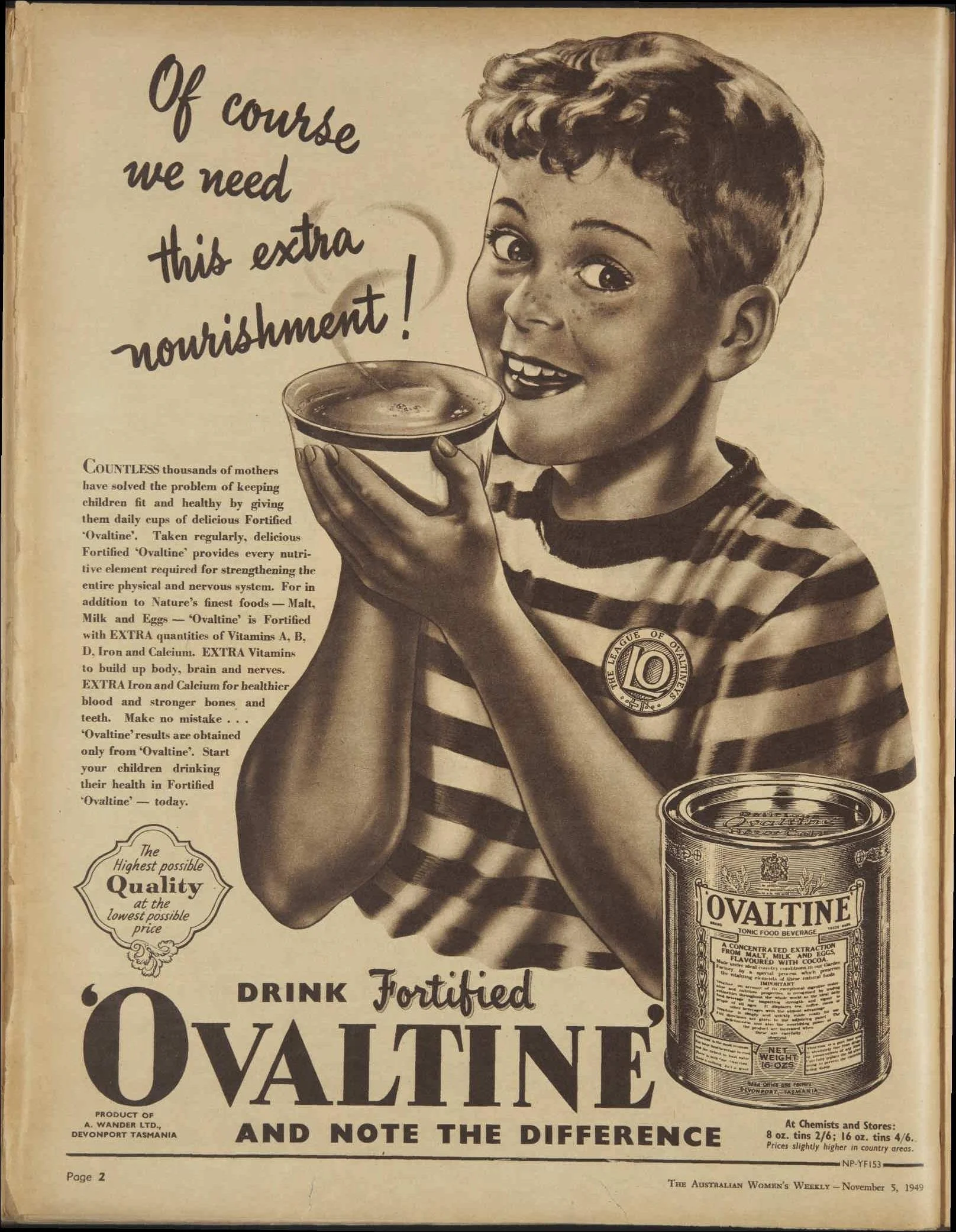
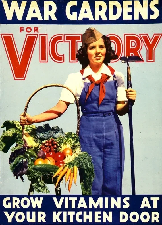
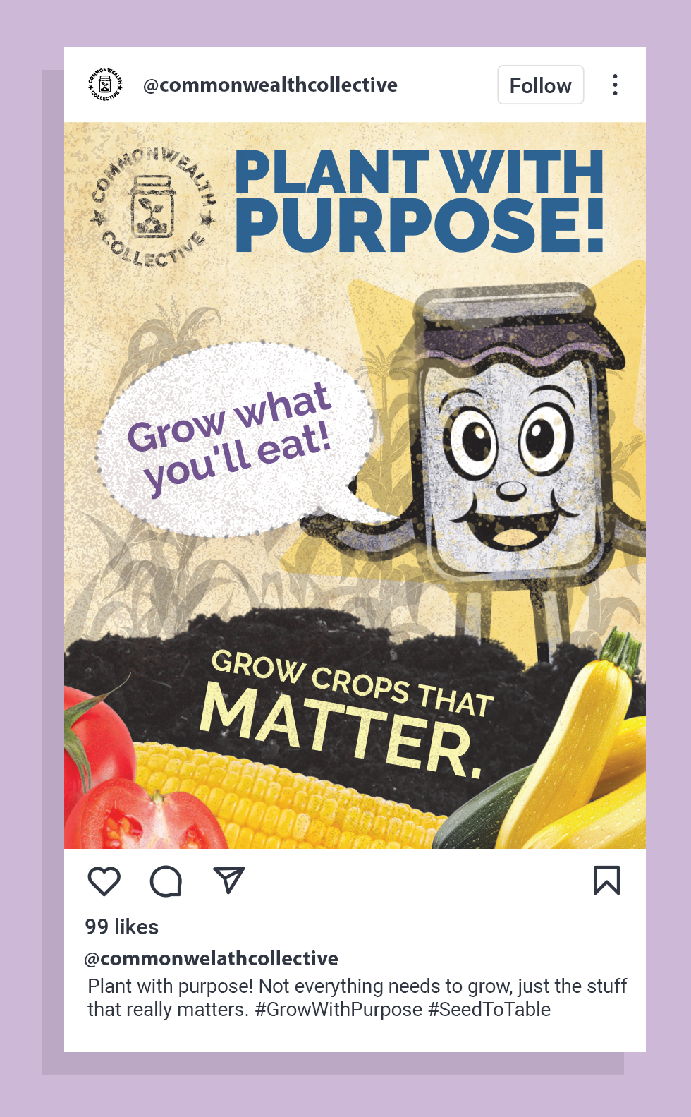
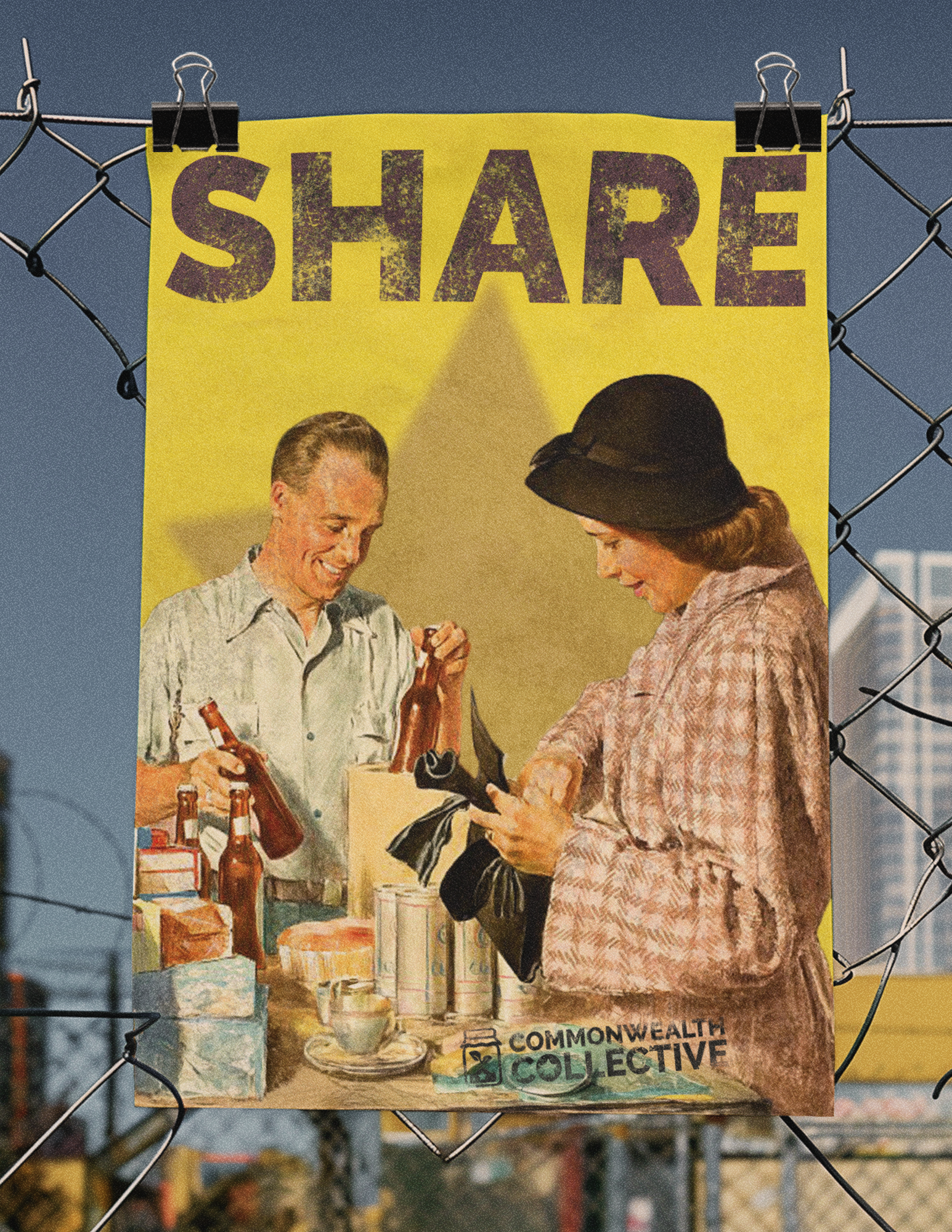
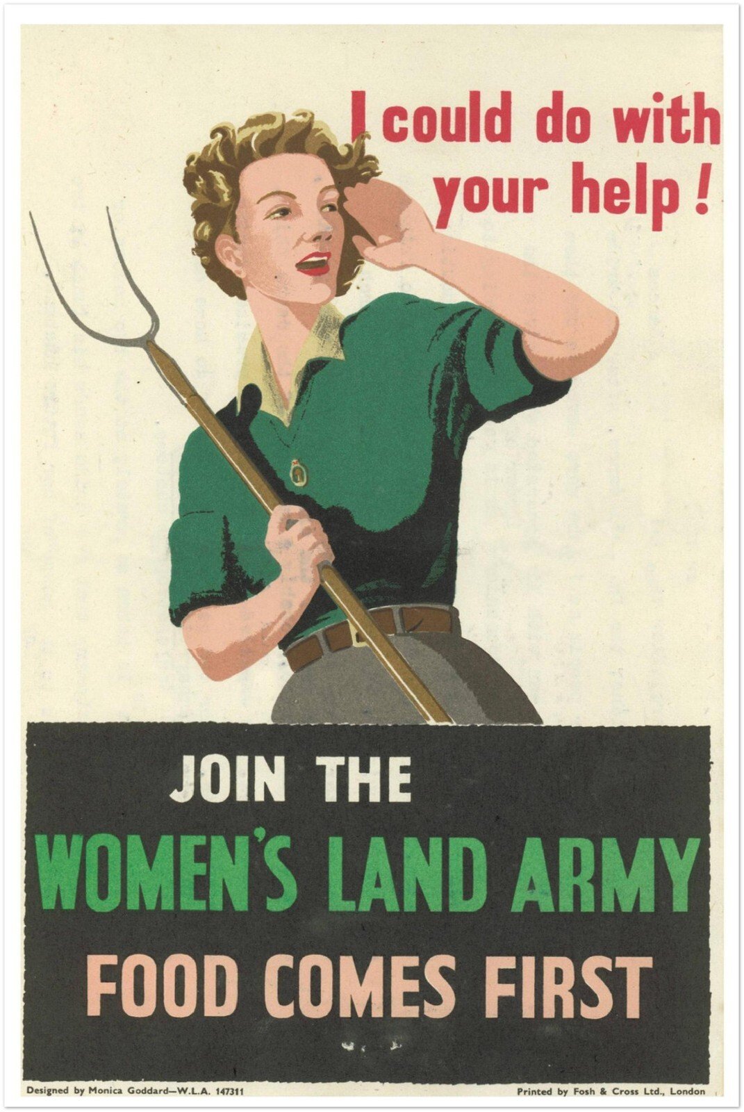
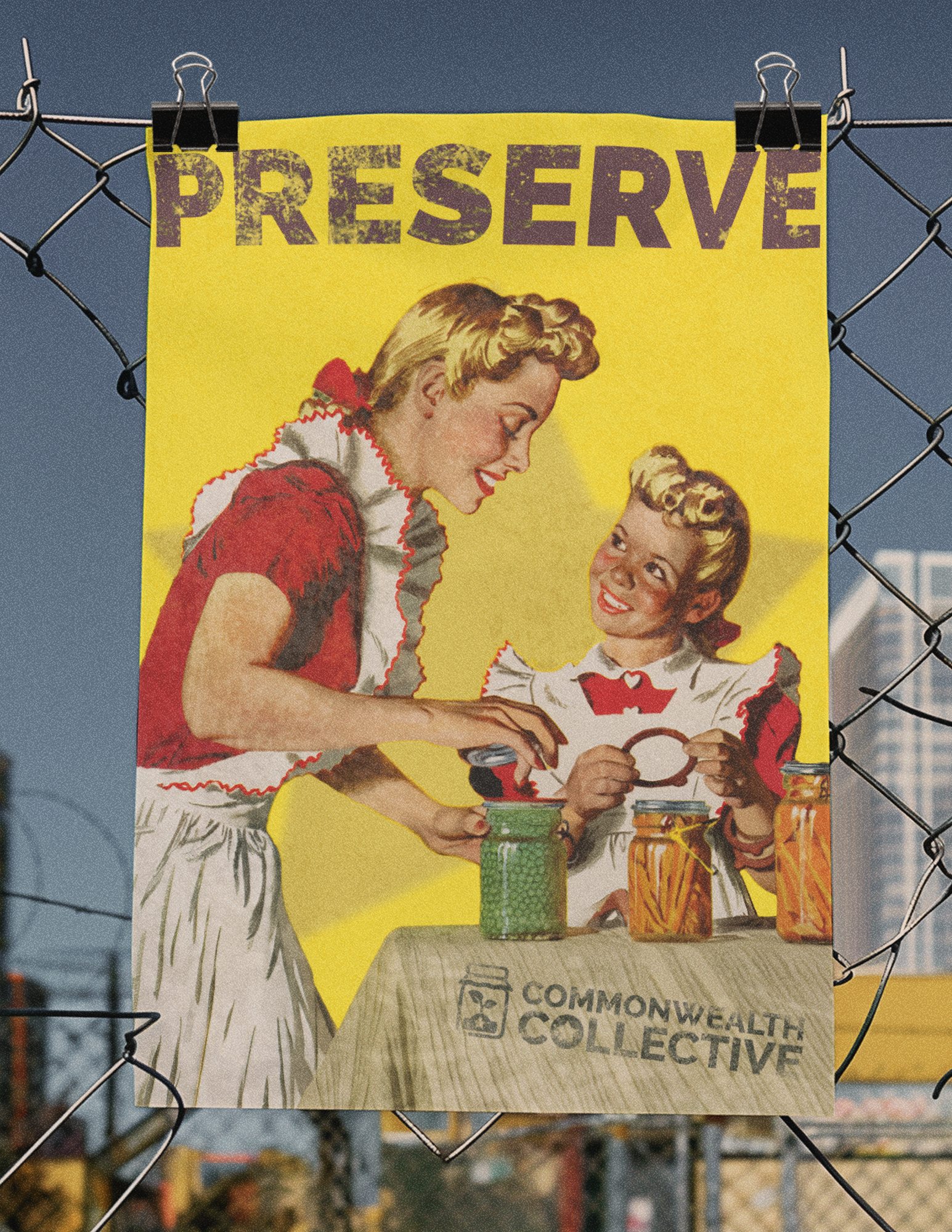
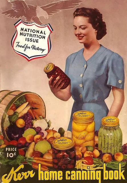
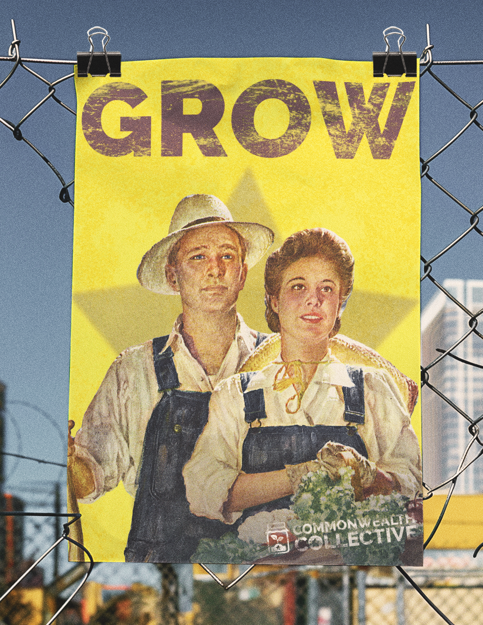
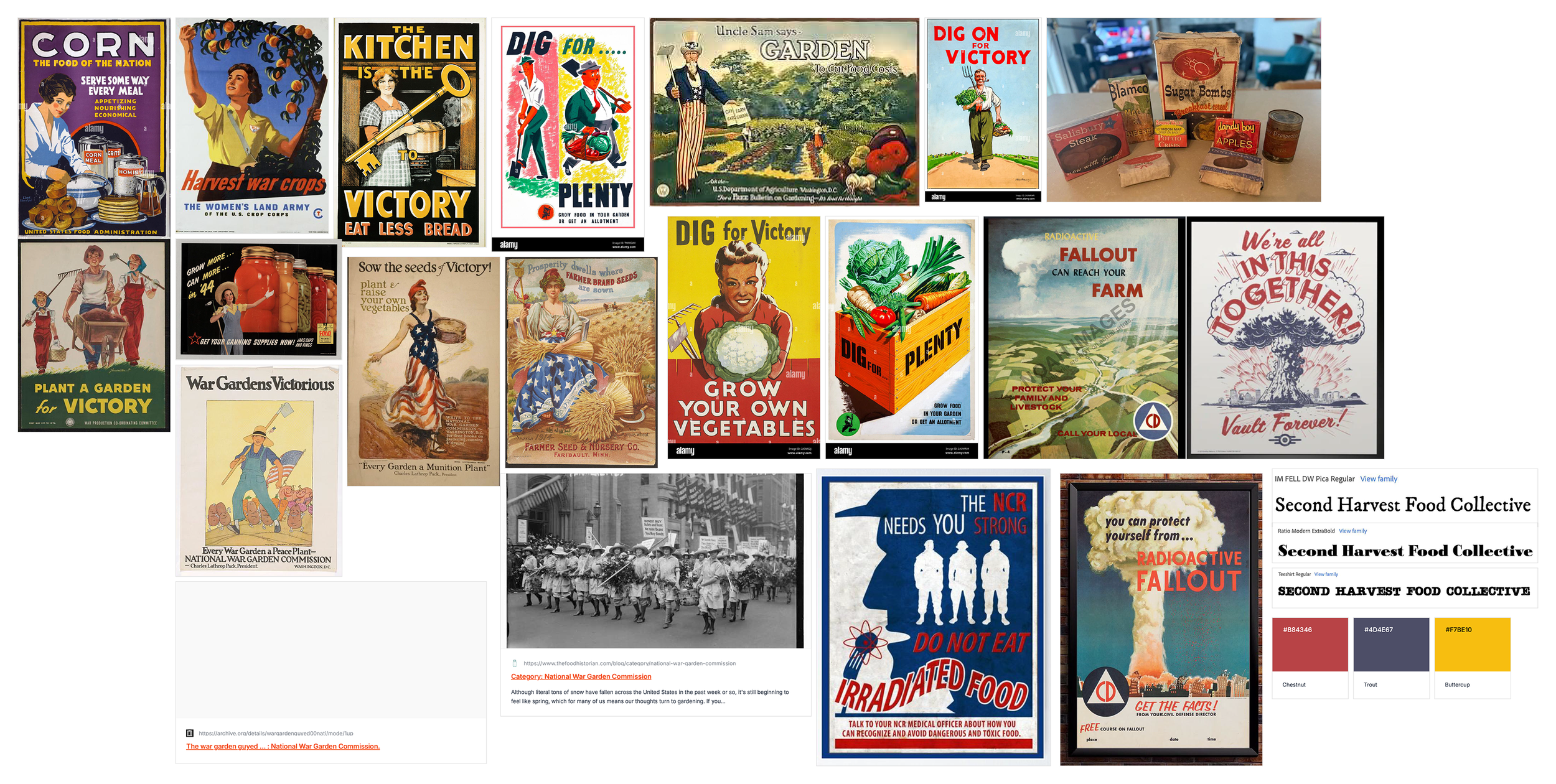
Drew inspiration from vintage wartime posters and victory garden campaigns, pulling in bold, graphic compositions and a strong sense of purpose-driven messaging. The visual language leans on this historical influence to create a feeling of unity, resilience, and shared effort within the collective.
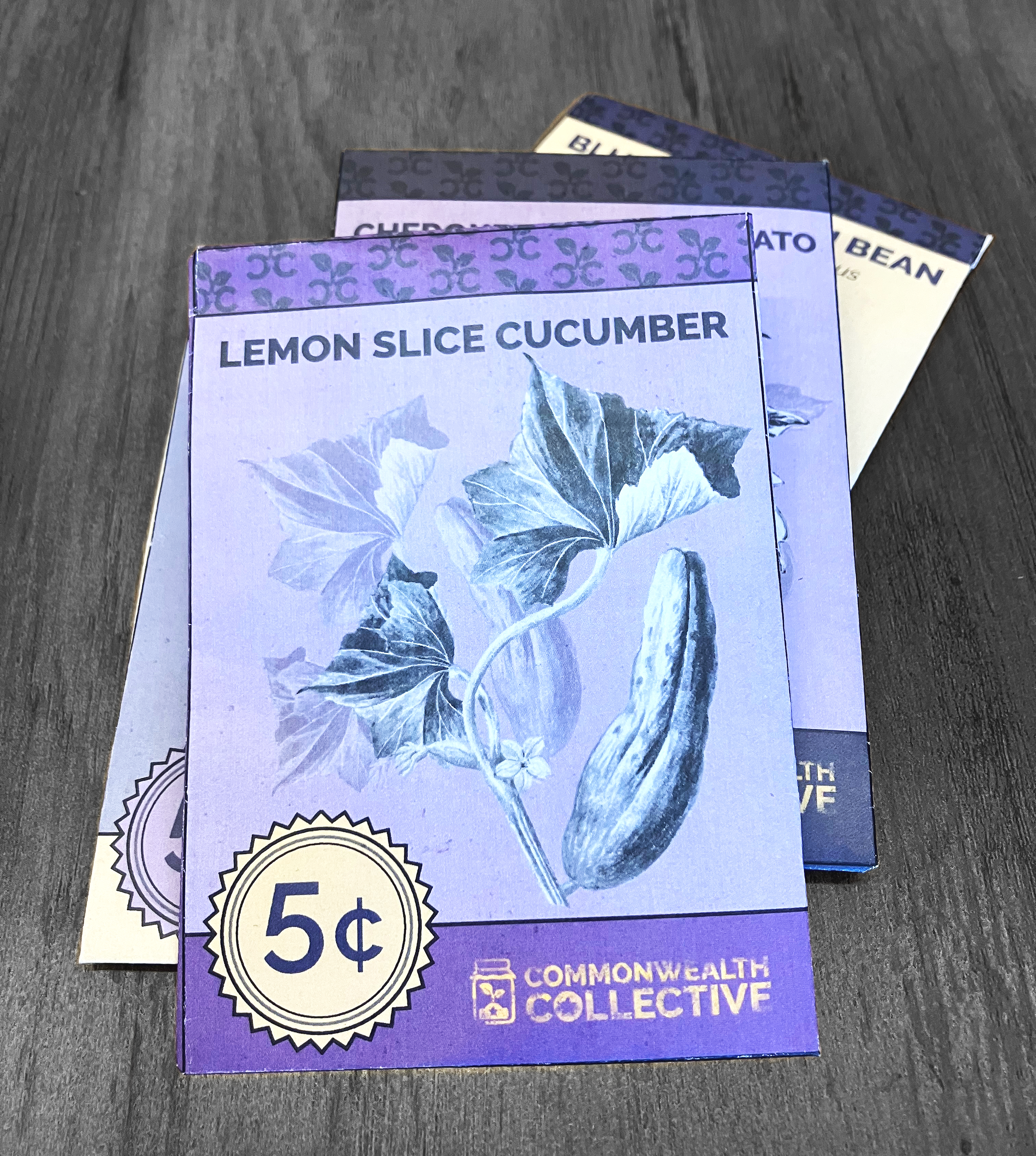
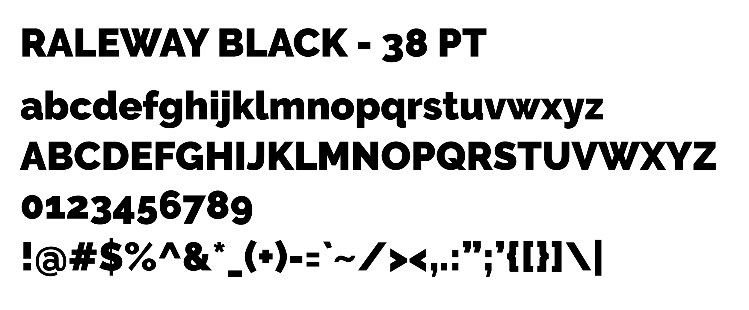
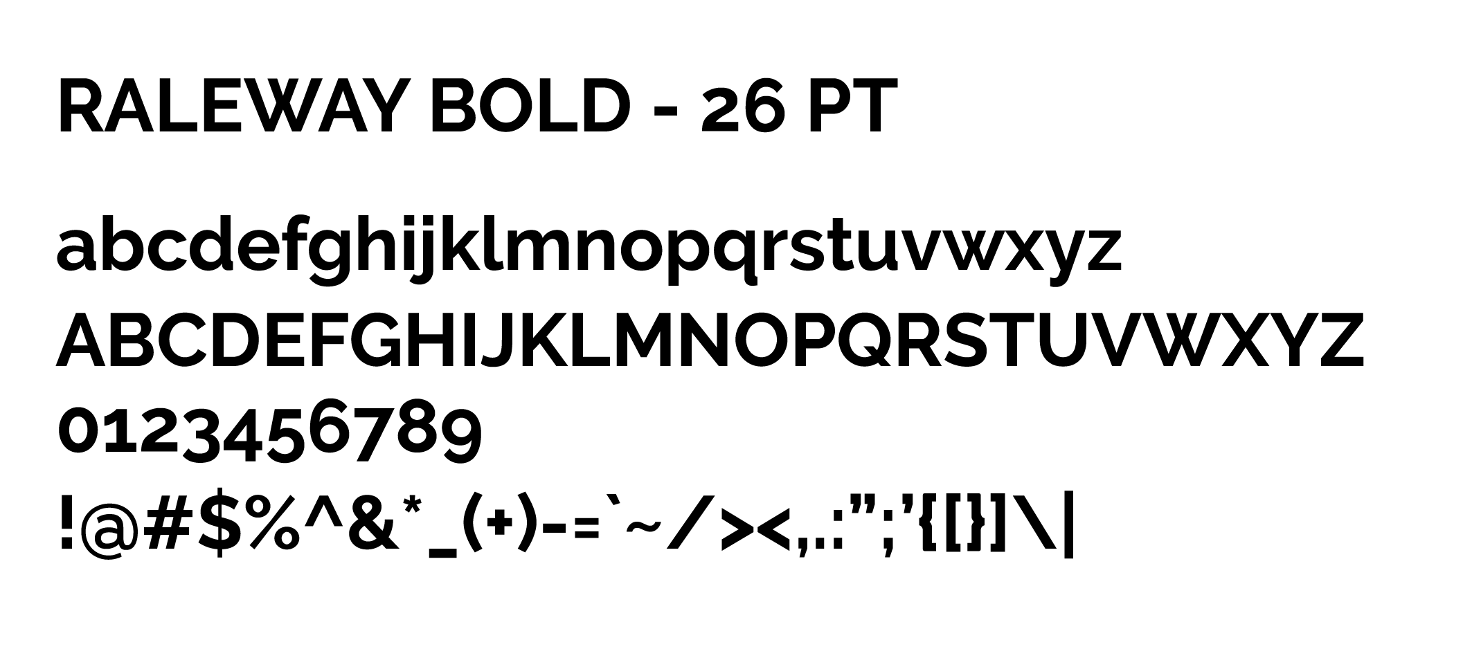
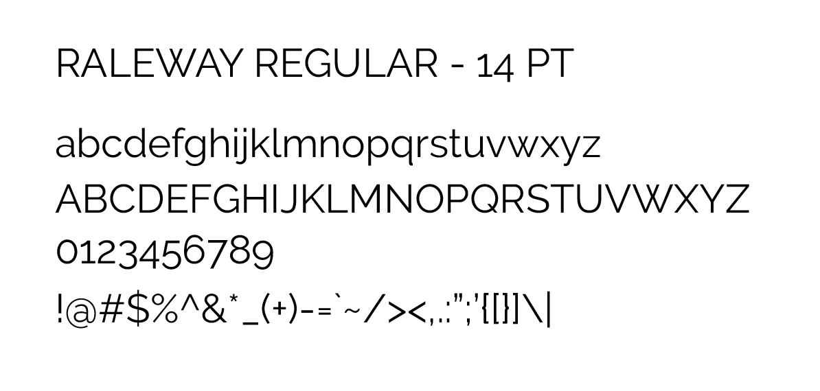
Typography choices reflect that balance, pairing expressive, character-driven display type with clean, structured fonts to keep everything readable across different applications. This allows the brand to feel both expressive and organized, supporting a wide range of artist voices.
The color palette is rooted in muted, heritage-inspired tones. Deep reds, worn blues, and warm neutrals. Which created a cohesive system that felt grounded, nostalgic, and visually impactful across print and digital materials.


Visual Elements:
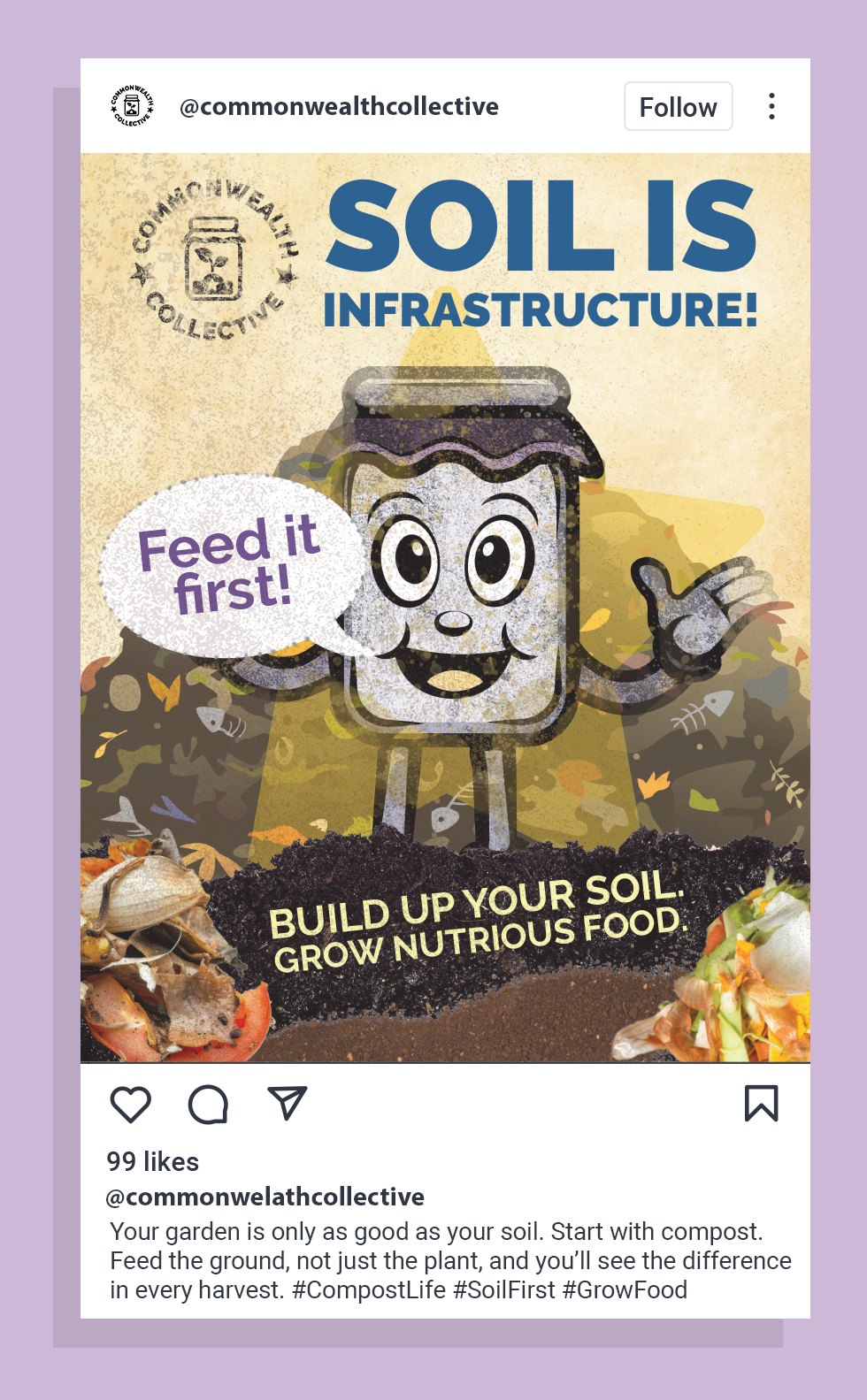
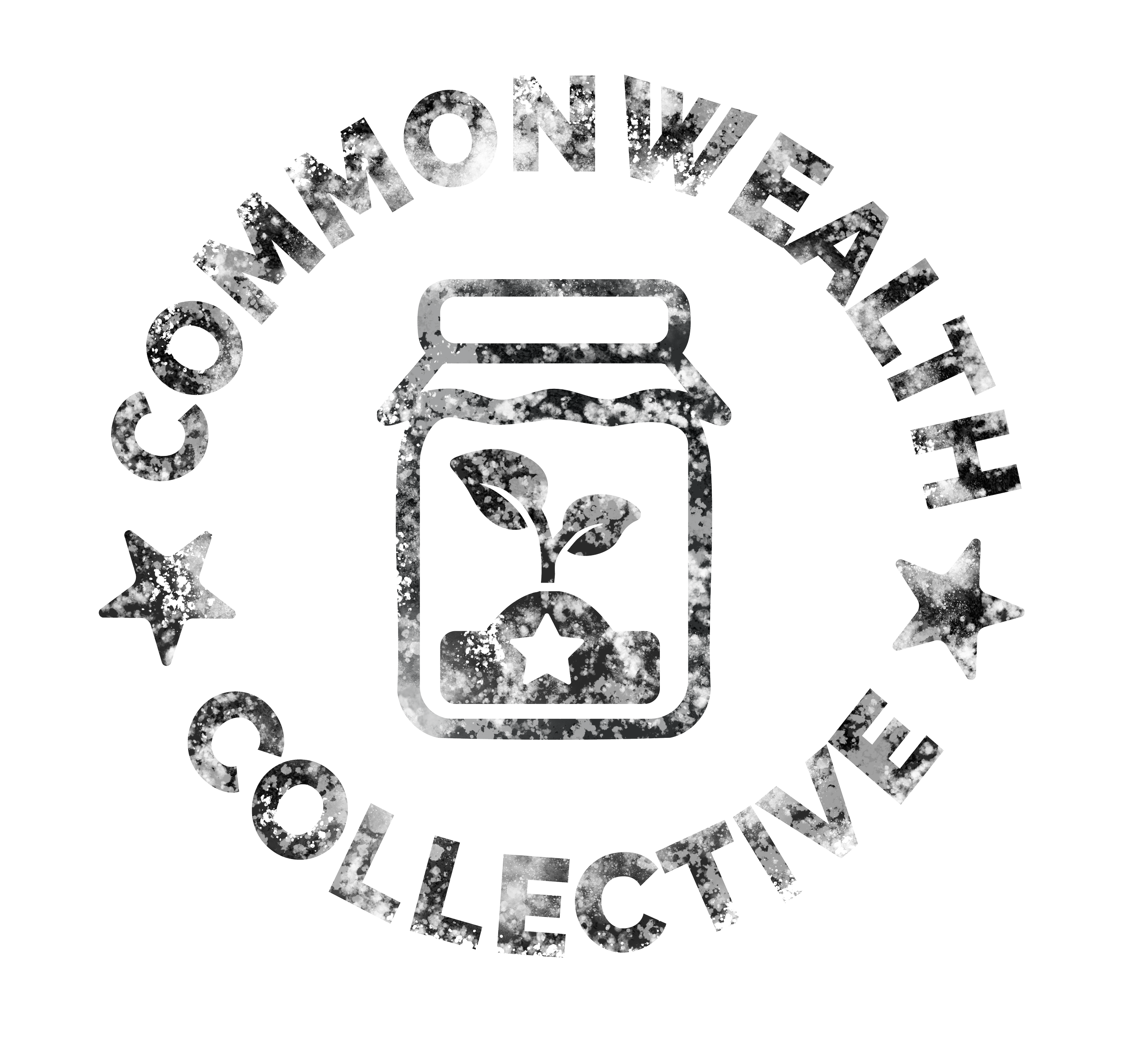
Developed a set of graphic elements inspired by vintage poster motifs, including simplified icons and symbolic forms that reinforce themes of community, growth, and shared effort.
Created repeating typographic patterns using short, rally-style phrases to echo the tone of historical campaign messaging and add visual rhythm across applications.
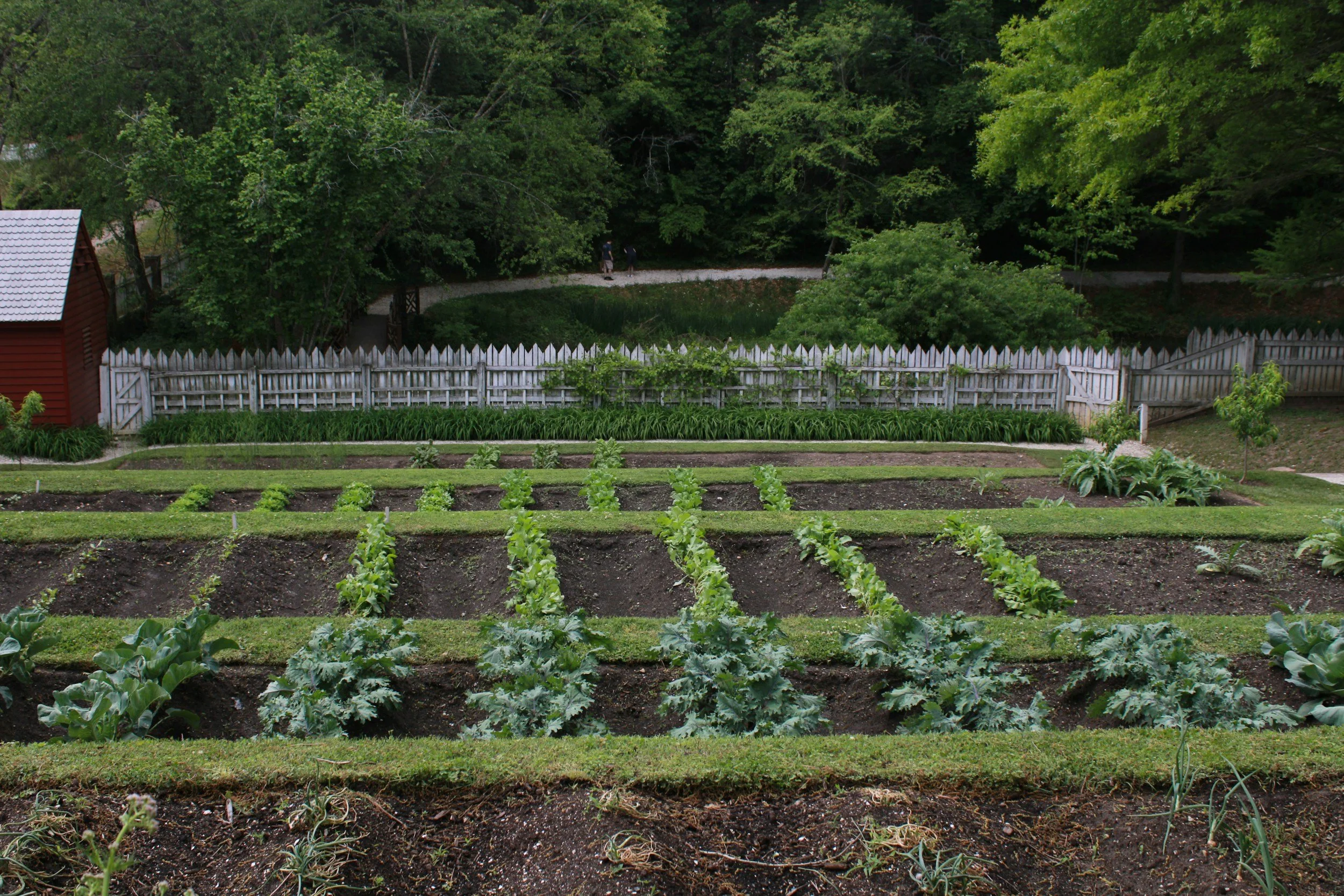
Curated imagery and built mockups that place the identity in real-world contexts, helping show how the brand lives across exhibition materials, promotional pieces, and environmental graphics.